Days of Heaven and Terrence Malick
From time to time I will talk candidly about designing the titles for one film or another and the experience of collaborating with the filmmaker.
DAYS OF HEAVEN (1978)

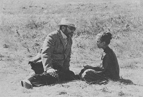
I would often visit director Terry Malick in his cutting room at the BBS building where producer Bert Schneider and director Bob Rafelson were located.
I had met Terry on his first film, Badlands, when he was editing in my little old motel building where my office was and he was very excited for me to do the titles for his movie. The only trouble was he had had them done and then wanted me to do them, but when Warner Bros. picked up the film they wouldn’t pay for the re-do, so Terry promised me I’d do his next one and that was Days of Heaven.

Terry was always very accessible and focused in the moment, but when I joined the film he was already editing for many months he was having a a hard time making decisions. When we finally settled on the concept of old historical photographs from the period of the film to set the environment and texture for the film, I began researching well known photographers of the era to use some of the pictures of Lewis Hine and others.

Well, I finally got enough great pictures to start designing them into a sequence. In those days there weren’t any computers and everything was shot on film.
It took me at least a couple of months to locate and acquire enough pictures to fill out a 2 – 3 minute sequence. As I finally cleared the rights on the first set I then created an order for about 15 photos and I prepared the photographs for the animation camera and shot it as a montage sequence with gentle, exploring camera moves linked by very slow, graceful dissolves.
When we viewed the first shoot Terry was thrilled and thought it worked well as a sequence, but, he wasn’t sure about every single picture and he wanted to further examine the order and the nature of the cameras moves that examined each shot. Now, it was one piece of action shot on one piece of film and there was no possibility of changes. It would have to be re-shot.
So, after further research to find more pictures to choose from we made another selection, I re-designed it into a new order and after Terry and I discussed how the camera moves might occur, I went off to my animation service and re-shot it for the second time.

After viewing the second take, Terry again felt it still wasn’t totally to his liking, so we started the process over again. I acquired some new pictures, we made a choice of a few new ones to replace the old one, I prepared the new artwork, wrote new camera directions (called ‘counts’) and then re-photographed the still photos on the animation camera and sent the film to the lab.
This basic process went on for quite a few more times. Each time Terry in general loving how the sequence looked but still having problems with either the content, the order or the camera moves.
Sometimes we’d change direction on one or two moves, or trade places with one picture for another or just replace one for another, or sometimes even add a picture here and there.
During all of these months that began to pass I continually asked Terry what music was to be over these images but, he was still in the throws of deciding so I couldn’t let the music motivate me emotionally like I usually did in order to find just the right emotional tone of the images to blend and compliment the music.
Well, after nearly a year of changing, selecting images, re-designing and re-shooting, we finally had a final background sequence that I could finally move to the next step and that was to design the title over the montage sequence that I had created.
So I began presenting vintage typestyles that I had located from the antique typesetting archive of old time typographer Vern Simpson. Vern hand set all of his ‘hot metal’ foundry type by hand personally as he stood in front of the California Job Case type font drawers and selected just the right lead slug letters so the type looked absolutely authentic – because it was.
It was all used back in that era by all of the businesses and companies that Vern set type for from as far back as the twenties in Los Angeles.
There was three really wonderful fonts from the nineteen-teens that I was most fond of, so I made some tests to finally settle on the one that made the words and names of the personnel on the film look the best and still be true to the era, the times and the characters and storytelling style.
Once the typestyle was resolved and I made the subtle choices of the color, size, placement in the screen and when each title came in and out against the backgrounds, I was ready to shoot it for final use.
By that time Terry had selected his main title music.
It was a haunting piece by Saint-Saëns that absolutely took you back to the period of the film and lulled you to the textures of the majestically elegant sepia photographs from a long lost time gone by. As you watched it and felt it, it slowly became a masterpiece. The film was released in mid June of 1978. In a cover story in the Calendar section of The Los Angeles Times the reviewer was ecstatic about the opening of the film and even mentioned my name with high praise as the designer of the Main Title Sequence.

Excerpt from Charles Champlin’s “Days of Heaven” LA Times review, Sept. 17, 1978.
I was given a point of ownership of the film and for many years afterward I would get reports from Paramount Pictures explaining why the film was still in the red and hadn’t made any profits. And it never did.
More stories and anecdotes like this can be found in my book.